Create and manage custom reports
Last updated June 17th, 2026
The new console allows you to create custom reports to track and visualize your data. You can create a custom report from scratch, or duplicate and edit a prebuilt report.
You can manage reports created in the original console in the new console, and vice versa. However, the following limitations apply:
- When viewed in the new console, reports from the original console don’t display the Not marked field.
- The following filters are not compatible across the two consoles:
- New console: The Operator is set to a range when Filters is set to a date format such as Registration date.
- Original console: The Condition Type is set to Variable when Filters is set to Date format.
Create a custom report
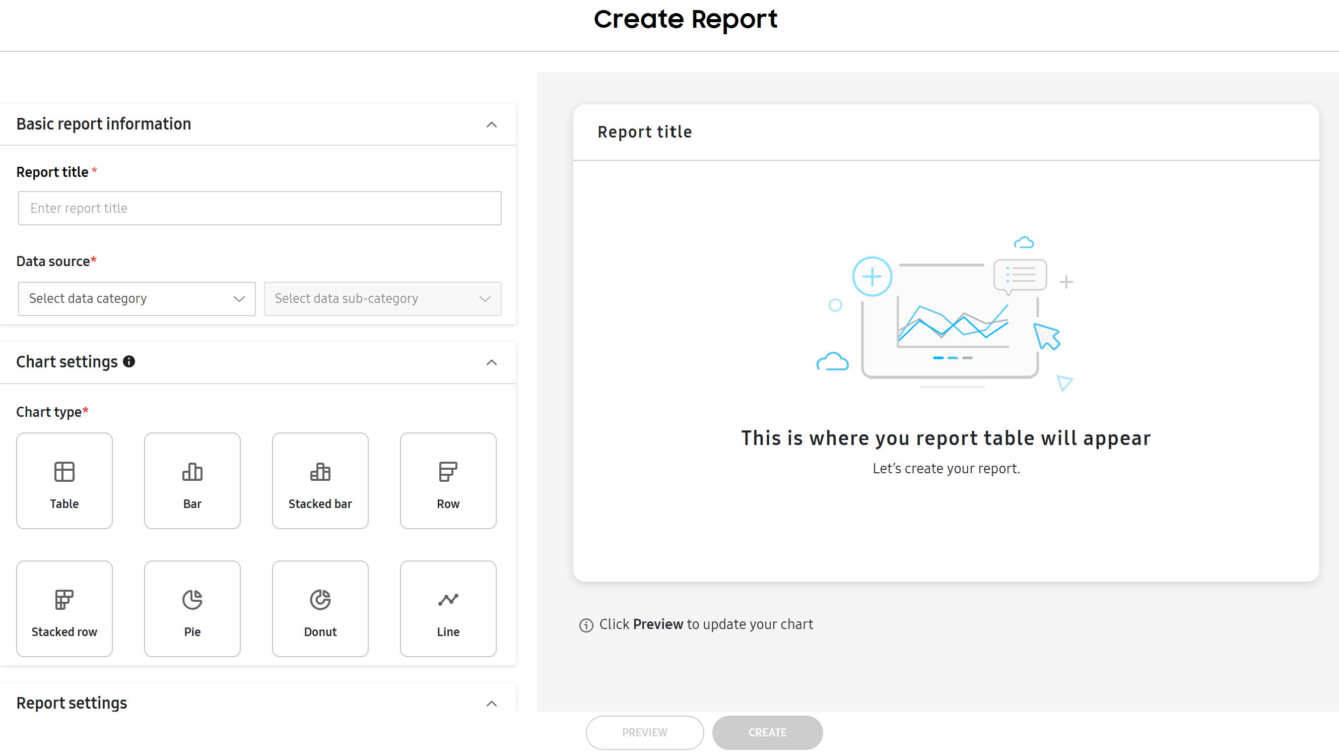
To create a custom report:
-
Go to the Reports page. By default, the page opens on the CUSTOM REPORTS tab. Click CREATE REPORT.
-
The Create Report screen opens. First set the Basic report information:
- Report title — Enter a title for the report.
- Data source — The category for the report. You can pick from App, Device, Group, Organization, or User.
- Select data sub-category — Narrows down the Data source to a specific sub-category. The options are dependent on the Data source selected. For instance, if you selected Device, options include Security status and License.
If the Data source is set to App and the data sub-category is set to Information installed in device, the table chart can display up to 100,000 data points. Admins can see all data points by downloading the report.
-
Configure Chart settings:
- Chart type – The type of chart displayed in the report. Select one of the following tiles: Table, Bar, Stacked bar, Row, Stacked row, Pie, Donut, or Line. Hover over each tile to see a short description of the chart’s design.
- Chart text – Toggle the following options on or off based on your preference for how the chart displays text. The options available differ depending on the Chart type selected.
- Show chart title
- Show axis labels
- Show legend
-
Next, configure Dimensions. These categories describe the chosen insights in the Measures field. Select an option from the drop-down. Click to add an additional dimension, or click to delete one. Available options depend on the Data source selected. See Report queries for a list of all available options. The following conditions apply: - Except for the table chart, all charts can display up to 1,000 data points only for the Dimensions field. - For the Bar, Stacked bar, Row, Stacked Row, and Line charts, you can’t add more than one dimension. - The Package dimension is only supported if the app package name matches what is added to your console.
-
Configure Measures and Calculation to define the quantities of data (Measures), and the aggregation method (Calculations) based on the selected Data source. Click the icon to add an additional measure, or click to delete one. Options for both are dependent on the Data source selected. - Measures include data insights collected by Knox Manage like App size or Device count. - Calculations include the Average, Sum, Maximum, Minimum, and Count values for each data insight.
For the Pie and Donut charts, you can’t add more than one measure.
-
Set Filters to define the criteria for what data is included. Define the Category, Operator, and Variable fields. Click + Add filter to add another filter.
Filters can be customized between admins. This means that if one admin creates the report with the first filter configuration, a second admin can edit the report to see a different filter configuration. When the first admin views the report, they see the first filter configuration, whereas when the second admin views the report, they see the second filter configuration.
However, if a report is scheduled to be emailed to admins, this filter customization doesn’t apply. Only the filters configured, or later edited, by the admin who created the report are applied to emailed reports.
-
Under Sort data, select whether you want to sort data in ascending or descending order: Most to least or Least to most.
-
Once all the required fields are filled, you can PREVIEW the report. The chosen data from your tenant is automatically organized and displayed in the selected chart type. Once the report is finished, click CREATE.
The report is created.
View reports
Once you create a report, you can view it from the Reports page. At the top of the page, you can search for a particular report by its name or the name of the IT admin who created it.
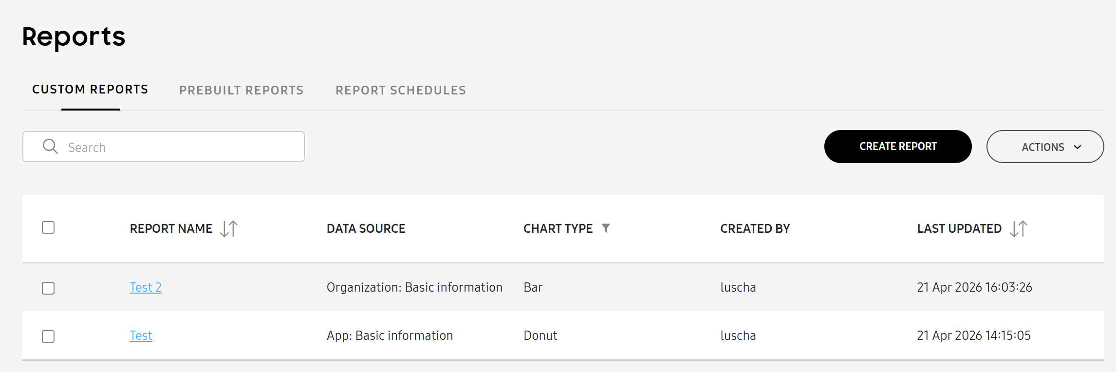
The following report information is available:
| Column | Description |
|---|---|
| REPORT NAME | The name of the report. Click on it to view its details. |
| DATA SOURCE | The data source and sub-category of the report, such as User: Basic information. |
| CHART TYPE | The chart type. |
| CREATED BY | The admin who created the report. |
| LAST UPDATED | The date and time that the report was last updated. |
View details and manage a report
You can view more information about a report in its details. To view a report’s details:
-
Go to the Reports page and click a report’s name. Its details panel opens.
-
The details panel displays the report at the top. Click to expand the report into full screen. On the full screen report, you can DOWNLOAD AS XLSX or DOWNLOAD AS PNG.
The rest of the panel displays basic details about the report. At the bottom, you can also EDIT REPORT or click to perform the following actions:
- Duplicate report — Duplicates the report, which creates a copy that you can edit. When you edit or duplicate a report, to refresh your view, you must click Preview again.
- Schedule report — Schedules the report to be automatically emailed to IT admins.
- Delete report — Deletes the report.
- Download as PNG — Downloads the report as a PNG. Table charts can be downloaded as XLSX files only.
- Download as XLSX — Downloads the report as an XLSX file.
Besides downloading the report, you can also complete the above actions from the ACTIONS drop-down on the Reports page.
On this page
Is this page helpful?