Overview
Last updated December 8th, 2025
The dashboard is your hub for all of your device usage insights. Here is where you’ll find at-a-glance views of your fleet’s status and health, organized into easy-to-use tiles. To launch the dashboard, click Dashboard from the left navigation menu.
After your devices are registered and enrolled in the service, you’ll see all of your business insights together on the main Dashboard. If you only want to see insights related to your fleet’s apps, network or battery data, you can click the respective sub-dashboard links in the left navigation pane to view just those insights.
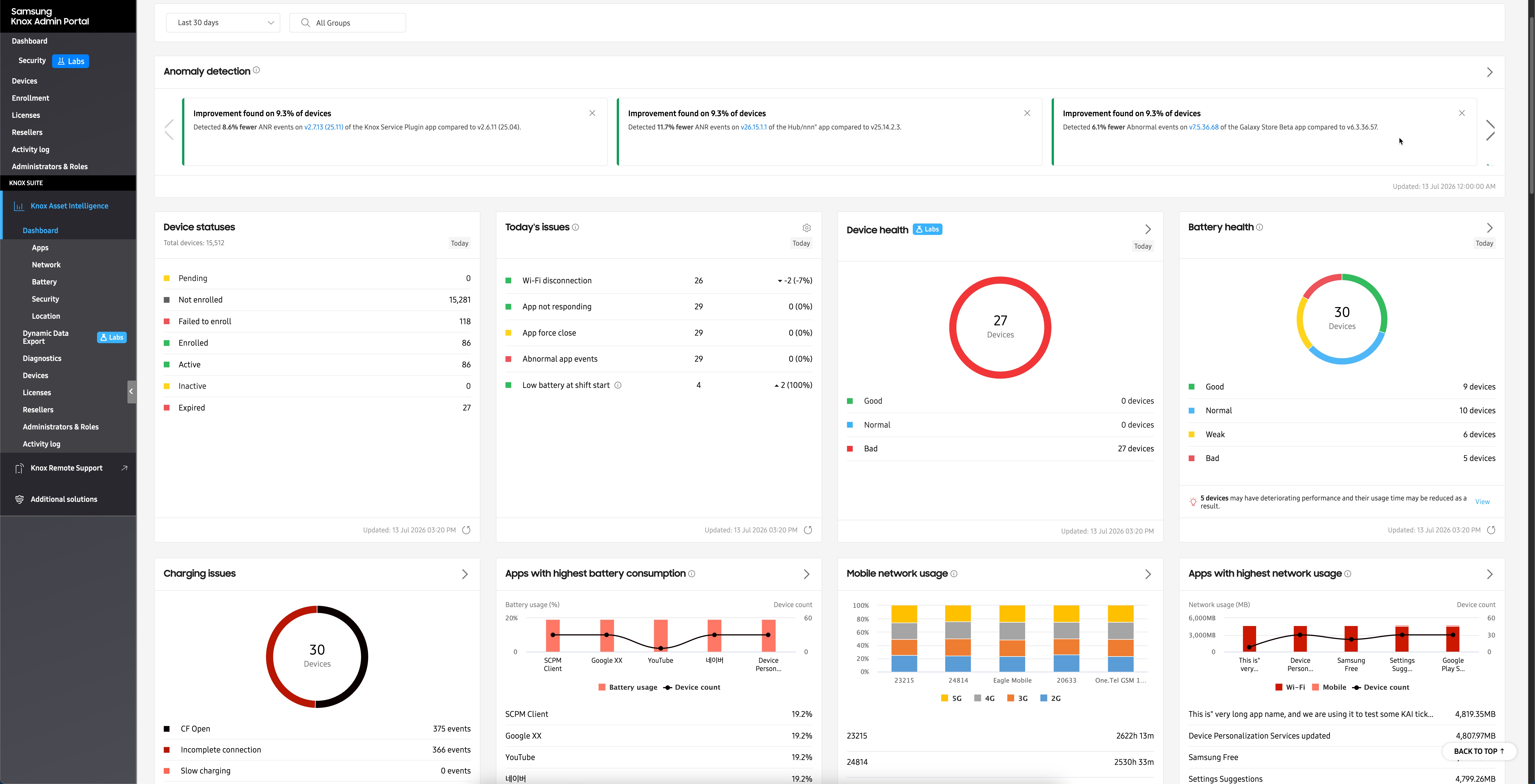
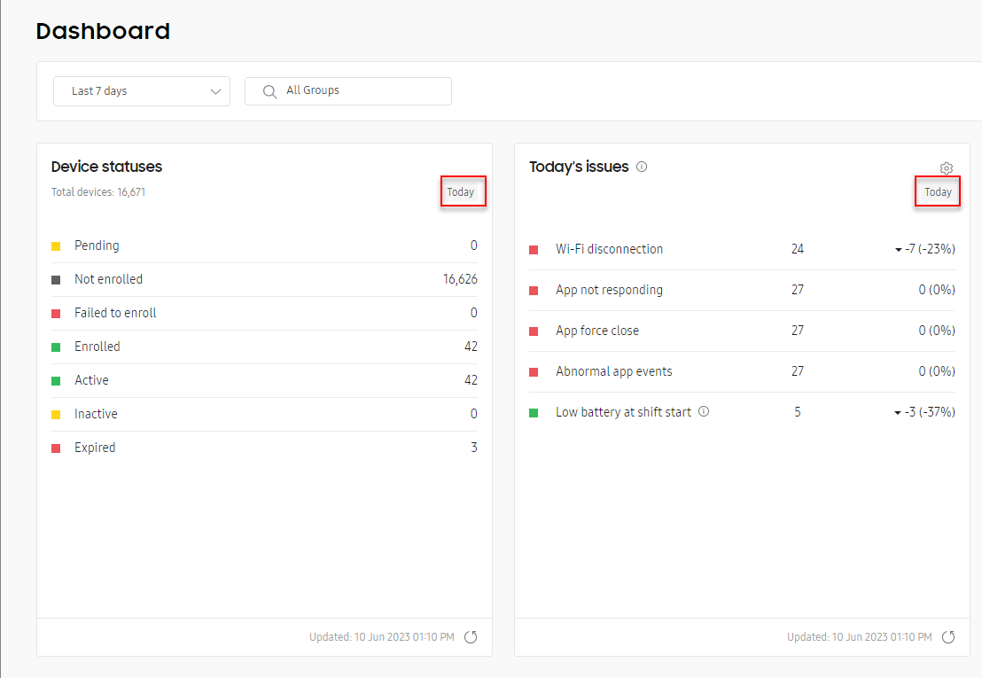
Use the date selector near the top of the dashboard to set a date range for your data. If data is available for that date range, your tiles will display data accordingly. Note that some insights display a Today tag, indicating that they will always report data for the current day, regardless of the date range selected.
Data refresh rates
When the Knox Asset Intelligence agent runs on a device, it continually collects device usage data and sends this information to the console to be turned into actionable business insights on your dashboard. Depending on the insight, there can be a delay between when data gets collected on the device and when it actually appears on your dashboard. The following table details the update rates for each insight type:
Real-time means that data is sent to the server at the time the event occurred, and you can see it on the Dashboard immediately. Previous day means that data is sent to the server on the day the event occurred, but you cannot see data on the Dashboard until the day after.
| Data type | Data insight | Dashboard update rate | Available date ranges |
|---|---|---|---|
| Common | Device status | Real-time | Can only view data for Today |
| Battery | Battery status and state of health | Real-time | Can only view data for Today |
| Low battery, Battery drain, and Charge events | Previous day | Can view data for Yesterday, or Last 7, 14, 30, or 60 days. | |
| Battery level at shift start | Real-time when viewing Today's issues, otherwise Previous day. | Can view data for Yesterday, or Last 7, 14, 30, or 60 days. | |
| Battery level at shift end | Previous day | Can view data for Yesterday, or Last 7, 14, 30, or 60 days. | |
| App | App usage | Previous day | Can view data for Yesterday, or Last 7, 14, 30, or 60 days. |
| App issues | Real-time sent hourly by default. Can be changed in Dashboard Settings. | Can view data for Today, Yesterday, or Last 7, 14, 30, or 60 days. | |
| Network | Wi-Fi disconnections | Real-time | Can view data for Today, Yesterday, Last 7, or 14 days. |
| Mobile network usage | Previous day | Can view data for Yesterday, or Last 7, 14, 30, or 60 days. | |
| Network latency response time | Previous day | Can view data for Last 7, 14, or 30, days. | |
| System | Storage usage status | Real-time every every 3 hours. | Can only view data for Today. |
| KSP | Knox Service Plugin | Real-time | Can only view data for Today. |
| Location | Location status | Real-time | Can only view data for Today. |
| Security | Warranty bit | Real-time | Can only view data for Today. |
Dashboard tiles explained
Whether you’re viewing the main Knox Asset Intelligence Dashboard, or one of the sub-dashboards for Network, App, or Battery insights, each tile generally consist of the following components:
-
The main data set displaying a table or chart of the insight’s top issues or events.
-
An option to view expanded data insights or settings.
The option to view expanded data from the tile may not be available for all dashboard insights.
-
A notification section that lets you know when data thresholds are reached, as well as other important information related to your insight. See Dashboard settings: Thresholds for more information.
-
A date and time stamp for the last update, and a manual refresh button to request new data. See Data refresh rates to learn more.
Dashboard tile view
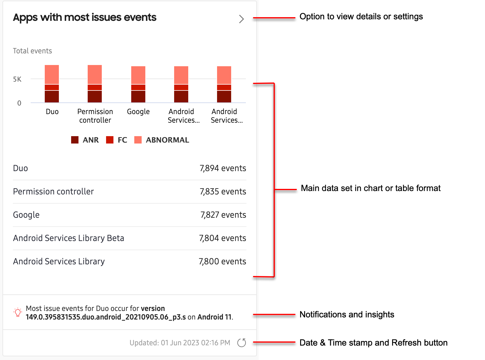
Every dashboard insight consists of a dashboard tile view that summarizes key data in the form of charts, tables, or lists. Some insights like Apps with most issues provide a chart and a list to offer greater detail about the data.
Just below the tile’s main data set, you might see alerts, notifications, or other important information related to your insight. Some dashboard insights like Apps with highest network usage display notifications when critical event thresholds are reached (for example, when apps use more than 100MB of mobile data per day), while other insights like Total app usage display the top contributor to the insight (for example, the app that was used the most in the fleet).
You can set data thresholds that trigger dashboard notifications in the THRESHOLDS tab of the dashboard Settings page. See Dashboard settings: Thresholds for more information.
Near the bottom-right corner of each tile, you’ll see the date and timestamp of the insight’s last update, and a manual button to request new data. Note that some insights update in real-time, while others update once a day, or once every hour. See Data refresh cycles to learn more about each insight’s data refresh rate.
Expanded details page
To help you analyze critical fleet issues in greater detail, most dashboard tiles provide an “expanded details” view of the insight’s data. If an insight has an expanded details page, you can click the button near the top-right corner of the tile.
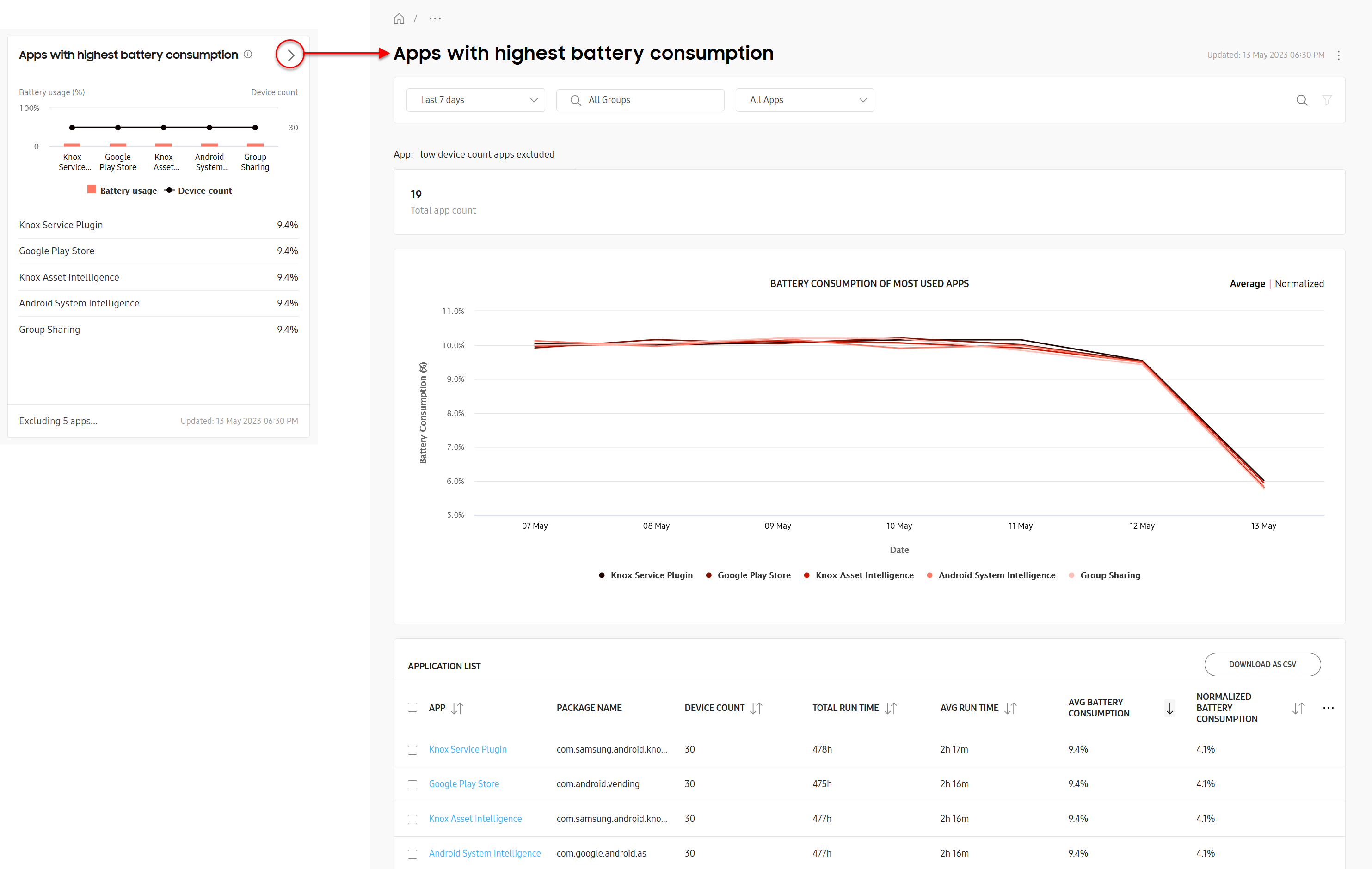
Most insights include a chart of the most critical issues near the top of the expanded details page, and a table detailing all issues near the bottom, while others might just display information in a table (without a chart).
For example, the expanded details page for Apps with highest battery consumption shows the top-five worst performing apps, and their consumed battery power percentage over the selected reporting period. While the chart only displays the top-five worst apps, the table below displays every app that reported excessive battery consumption over the same reporting period.
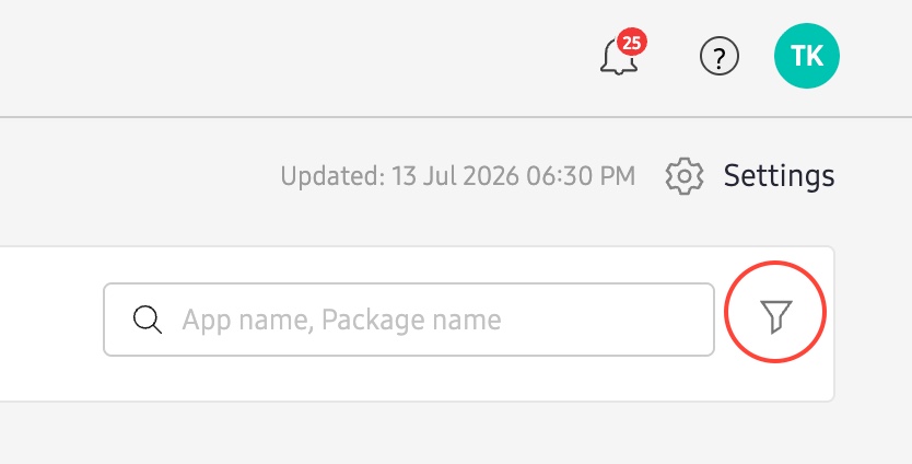
Some insights allow you to filter the data set to help you focus on key issues first. If the option is available, click the icon near the top-right corner of the page (next to the search bar) to open the filter panel, then specify your parameters and click Apply.
In the expanded details table, you can click the CUSTOMIZE TABLE button ( ) to show or hide table columns. Note that some columns are mandatory and cannot be hidden, and most insights only allow you to display up to 7 columns at a time. If the option is available, you can also click DOWNLOAD AS CSV to export the table in CSV format for offline viewing and analysis.
Drill-down page
For some insights, you can get an even deeper analysis of the data by clicking key values in the expanded details table. This “drill-down” view provides additional details not normally found in the insight’s expanded details page.
For example, in the expanded details page table for Apps with highest battery consumption, the key values are the application names in the APP column.
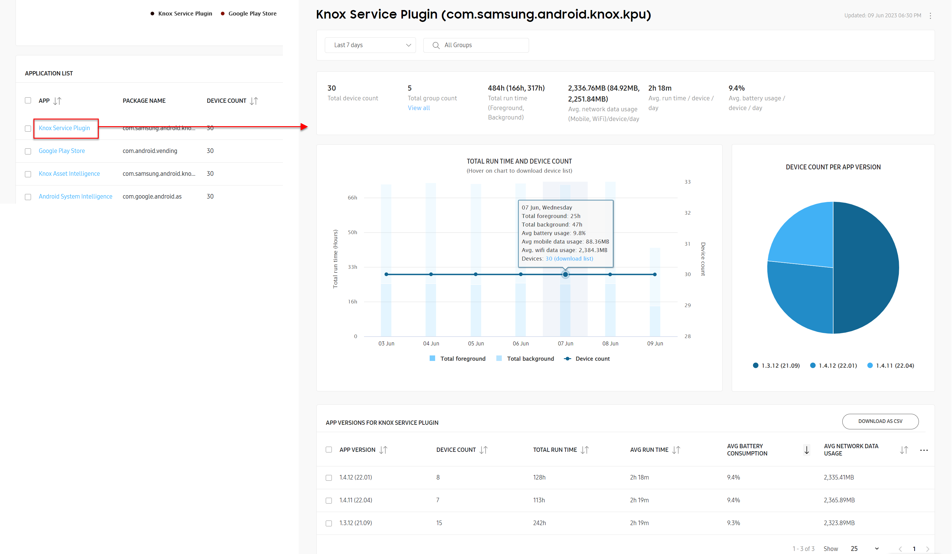
Clicking an application name in the table takes you to a drill-down page for that specific application, letting you see additional details like which versions of the app consumed the most battery power, and how many devices are running each version. This can help you identify if certain versions of an app are causing excessive battery drain, and how many devices might need to have their app versions updated or changed.
Like with the expanded details page, you can also click the CUSTOMIZE TABLE button ( ) to show or hide columns in your table, or download the table as a CSV file for offline viewing and analysis.
On this page
Is this page helpful?