Part 4: Choosing the Right Chart Type
Last updated August 28th, 2026
About
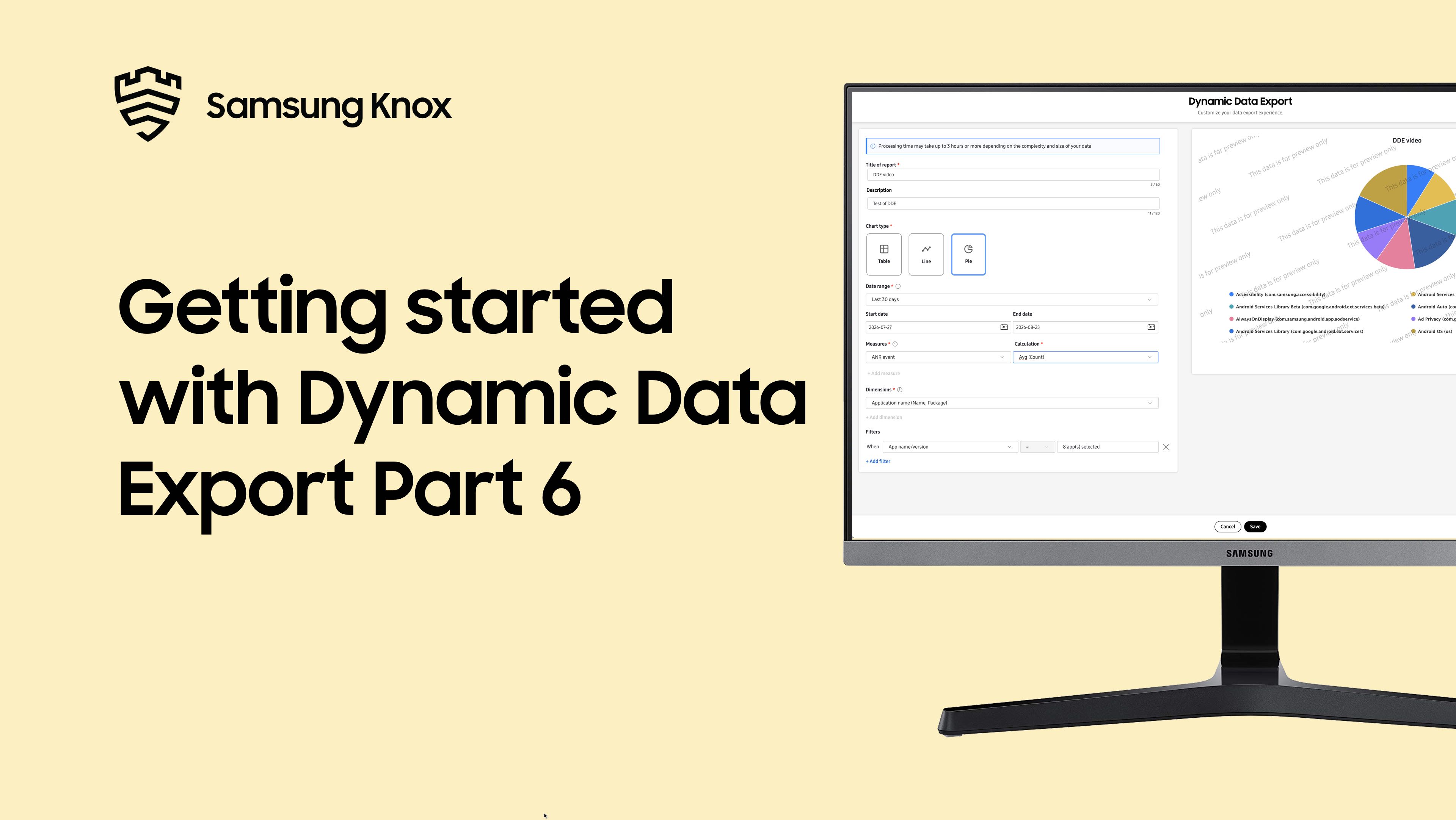
This video introduces the three chart types available in Dynamic Data Export. Learn about tables for detailed, precise data with exact numbers and side-by-side comparisons, line charts for spotting trends over time like daily battery levels and weekly app usage patterns, pie charts for showing proportions and percentages such as battery drain distribution across apps, and when to use each chart type for your reports.
Video chapters:
-
00:00- Introduction to chart types -
00:07- When to use tables -
00:26- When to use line charts -
00:48- When to use pie charts -
01:03- Pie chart best practices -
01:08- Quick summary -
01:16- Next steps
See more videos
On this page
Is this page helpful?