Knox Service Plugin UX guidelines
Overview
We refer to Mobile Device Management (MDM), Enterprise Mobility Management (EMM), and Unified Endpoint Management (UEM) partners as MDM partners in this guide.
The Knox Service Plugin (KSP) is a channel that enables enterprise customers — through the use of their chosen MDM partner console — to use Knox Platform for Enterprise features as soon as they are commercially available. This automatic deployment method ensures that IT admins can use the latest Knox features on the day they are launched, instead of waiting for their MDM to specifically integrate the features.
While KSP updates are deployed to devices directly using the Managed Google Play Store, we recommend MDM partners follow some user experience best practice guidelines to ensure the timely discovery and appropriate display of the KSP schema. These guidelines follow three major areas:
- Discoverability
- Schema rendering
- Feedback channel
Discoverability
To ensure KSP is discoverable from the MDM console, we recommend that your UI follows these guidelines:
-
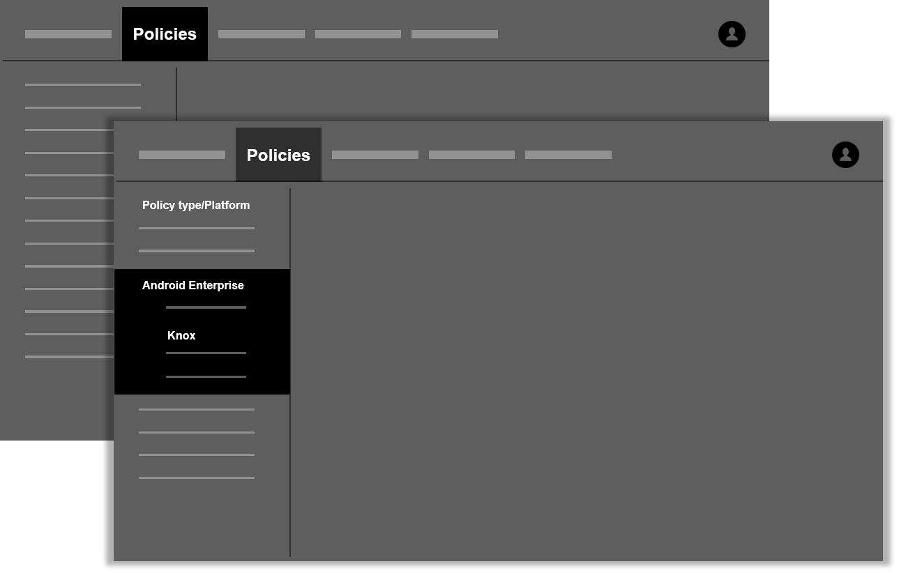
Show Knox policies as part of AE policies — Knox Platform for Enterprise customers can use KSP to set Knox policies on their managed Samsung Android devices. Ideally, user is able to configure Knox policies right from within the policies section of the MDM console.
-
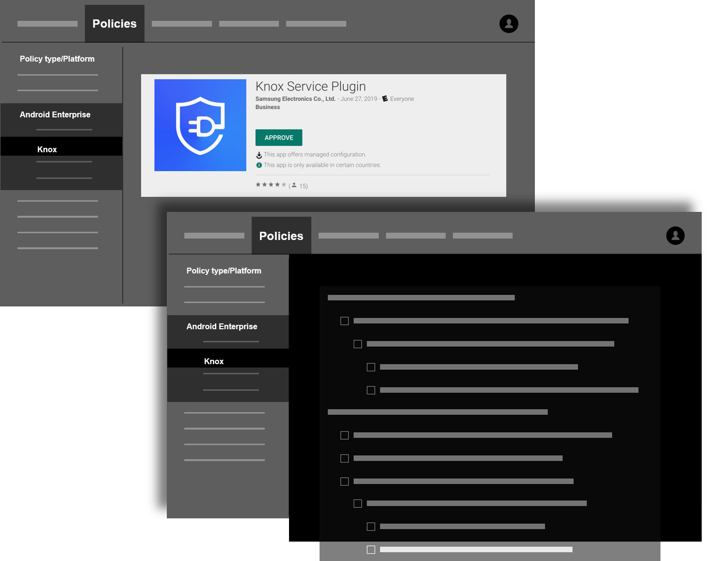
Make the KSP shortcut available in the Managed Google Play Store — We recommend adding a shortcut to help the MDM console user — most often the IT admin — to approve and access Knox Service Plugin directly from the Managed Google Play Store.
-
Show a shortcut to KSP — Once KSP is added to the list of approved apps, user can access Knox policies immediately from a shortcut in the MDM console.
Schema rendering
The KSP schema has four main components:
-
Basic elements — General operational controls for KSP. For example, turn on debug mode or input a Knox Platform for Enterprise license key.
-
Device-wide policies section — Device Owner (DO) policy controls. These are of global scope.
-
Work profile policies section — Profile Owner (PO) policy controls. These apply to only the Knox Workspace.
-
Configurations — Specific configuration properties that are used in conjunction with policy controls. For example, VPN profile settings, APN settings, or DeX customization settings. These can be used on either device-wide policies or work profile policies.
To ensure that the schema renders properly and clearly enough for maximum usability, ensure that your UI follows these recommendations:
-
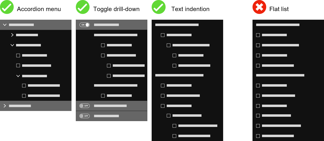
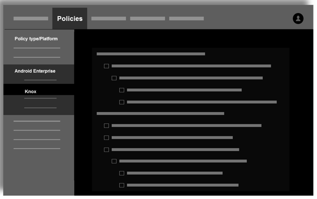
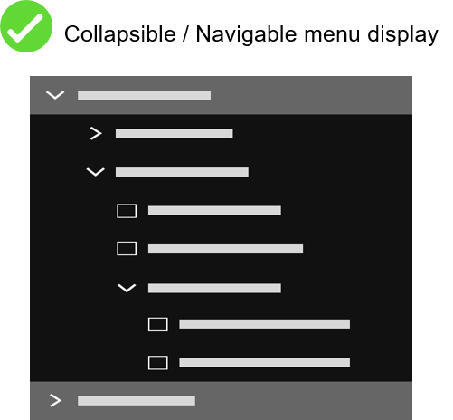
Show hierarchy to represent the four level policy schema and avoid a flat list of items — We recommend that you show the KSP schema using established hierarchical and grouping of UI controls, such as drop-down lists, text indents, or toggle buttons. Showing controls in this manner helps eliminate confusion about the relationship between different elements of the UI and lessen policy configuration conflicts or issues.
-
Enable easy navigation and readability of KSP policies using the following guidelines:
-
Maximize screen real estate through the use of resizable popups or an iFrame.
-
Use a collapsible menu to show the grouping of policies and provide context to users so users can easily recognize where the currently viewed policy belongs in the overall schema.
-
Avoid any UI that requires the user to scroll horizontally.
-
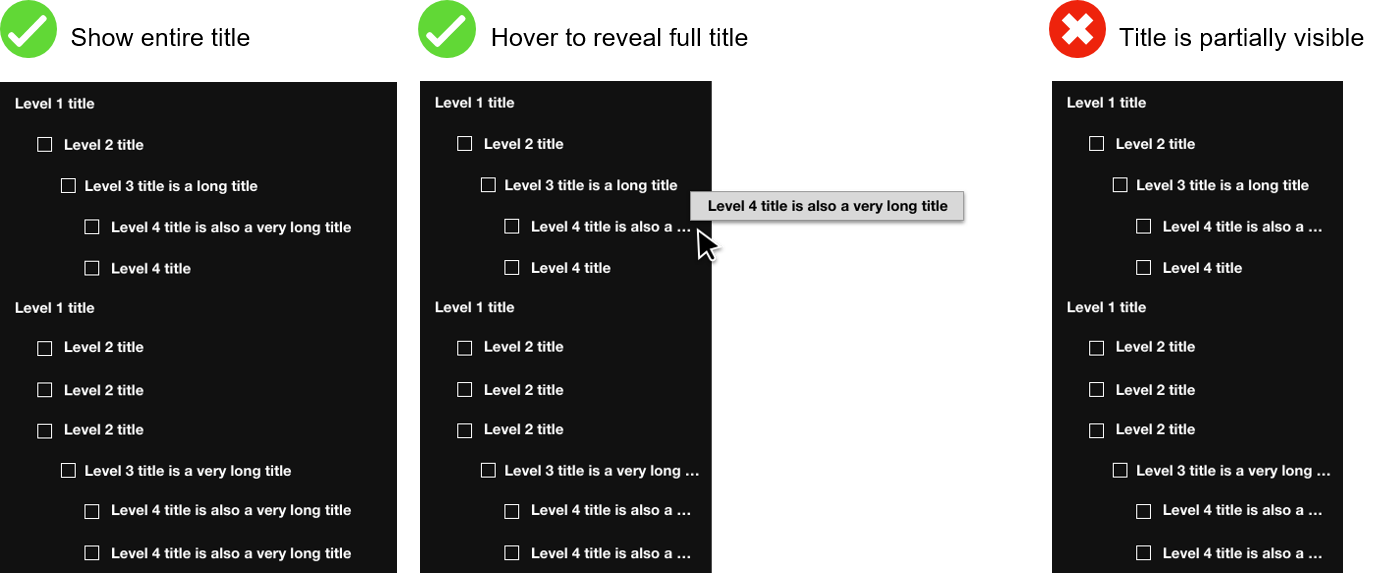
Show full policy title, that is the user can hover over the title to reveal full name if space is limited. User should be able to view the full policy title to ensure configuring the correct policies. If the space is limited and the policy title is truncated, user can reveal the full policy title by hovering over or using other interactions on the title.
-
Show just enough information to provide with direction, but not so much as to overwhelm the user. Displaying “Description” for all restriction type is not necessary and can create overwhelming experience for users. The provided schema has defined the restriction type as the recommended “Description” to show users. “Description” for other restriction type should be hidden in tooltip type of UI until user interacts with it.

-
Follow defined conventions for Restriction Types. For example,
<boolean>should only contain true or false binary options;<choice>should only contain the provided options from schema for single selection.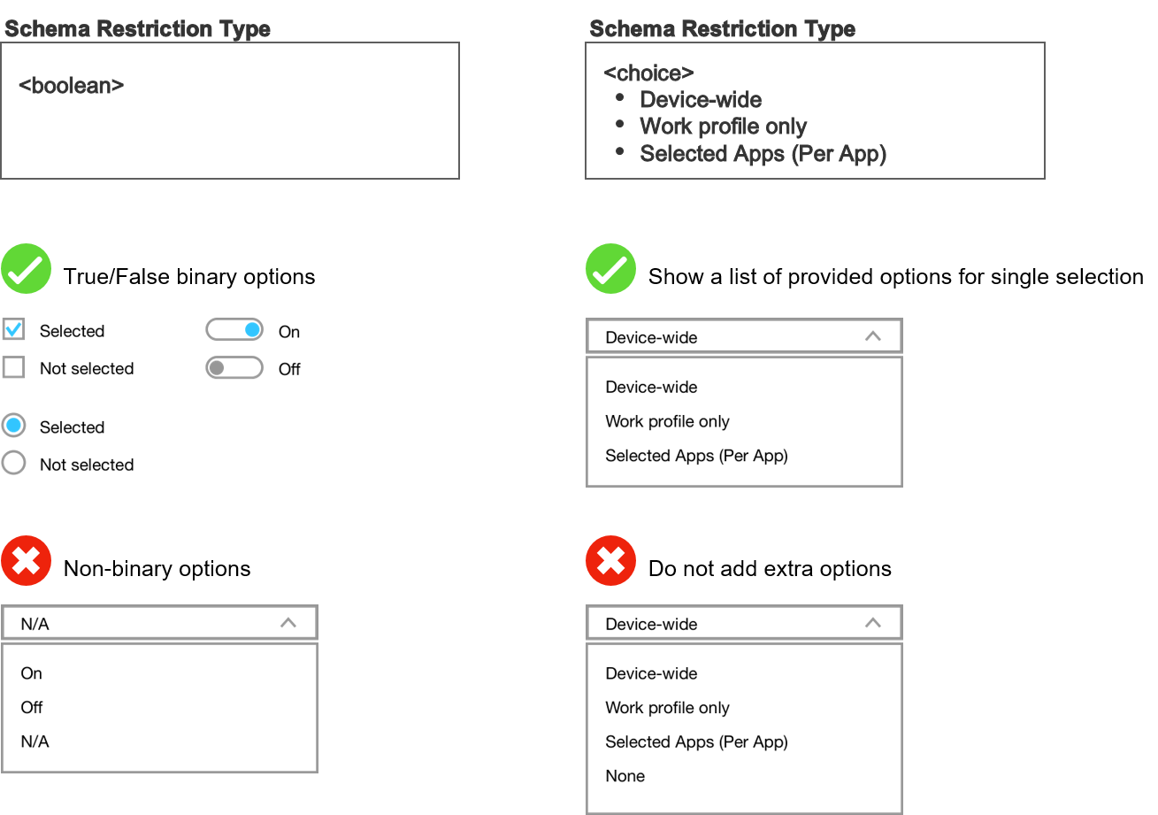
-
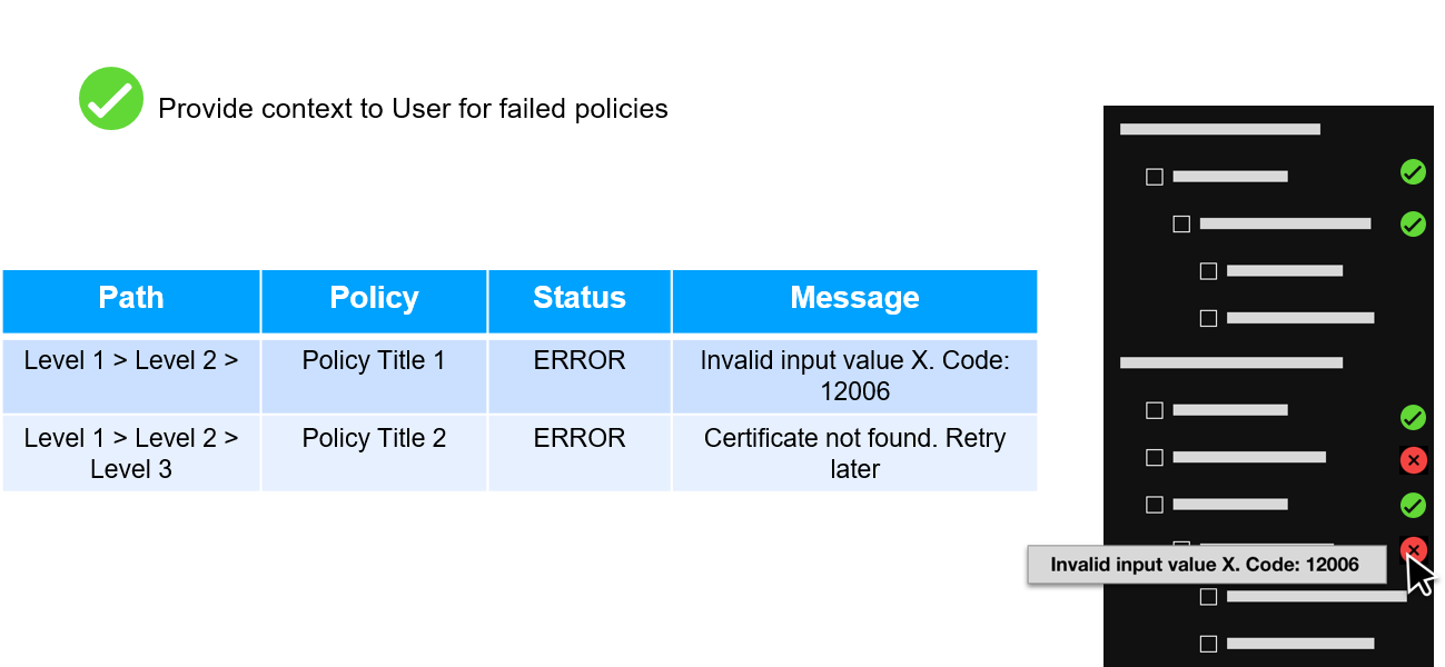
Feedback channel
For ease of use, we recommend that your UI follow these guidelines to provide feedback for user actions on the KSP app:
-
Show KSP results separate from other apps.
-
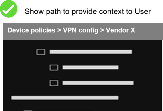
Provide context when showing KSP results. KSP returns status for many fields in the schema. Always include a title and path that shows where the field exists in the schema. For example, for key “doAppMgmtBatteryWhitelist” returned by KSP show Title as “Battery optimization whitelist” and path as “Device-wide policies > Application management policies”.
On this page
Is this page helpful?